How to Create a Stylish Navigation Bar for Your Website Using HTML, CSS, and Bootstrap
Create a Stylish Navigation Bar with HTML, CSS, and Bootstrap
Learn how to design and implement a modern navigation bar for your website using HTML, CSS, and Bootstrap. Follow this step-by-step guide to enhance your website's user experience.


Introduction:
A stylish navigation bar is an essential element of any website. It not only helps visitors navigate through your site but also enhances the overall user experience. In this step-by-step guide, we'll show you how to create a modern and responsive navigation bar using HTML, CSS, and Bootstrap.
Prerequisites:
Before we dive into the code, make sure you have a basic understanding of HTML, CSS, and Bootstrap. Familiarity with these technologies will help you follow along more effectively.
Step 1: Set Up the HTML Structure
In your HTML file, create a new <nav> element inside the <body> tag. This will serve as the container for your navigation bar. Within the <nav> element, add an unordered list (<ul>) to list the navigation items.
<!DOCTYPE html>
<html lang="en">
<head>
<!-- Add meta tags, CSS links, and Bootstrap links here -->
</head>
<body>
<nav>
<ul>
<!-- Navigation items will be added in Step 2 -->
</ul>
</nav>
<!-- Add the rest of your website content here -->
</body>
</html>
Step 2: Add Navigation Items
Inside the <ul> element, add list items (<li>) for each navigation item. Use anchor tags (<a>) to create links to different pages on your website. Give each anchor tag a meaningful href attribute.
<ul>
<li><a href="#home">Home</a></li>
<li><a href="#about">About</a></li>
<li><a href="#services">Services</a></li>
<li><a href="#contact">Contact</a></li>
</ul>
Step 3: Apply CSS Styling
Now, let's make the navigation bar visually appealing. We'll use CSS to style the navigation items, adjust the colors, and create a dropdown menu for smaller screens.
<style>
.navbar-nav .nav-link {
margin-right: 15px;
}
.navbar-brand {
margin-right: auto;
margin-left: 0;
color: rgb(255, 255, 255);
}
.navbar-brand:hover {
color: rgb(255, 0, 0);
}
.nav-link {
color: rgb(255, 255, 255);
}
.nav-link:hover {
color: rgb(255, 0, 0);
}
span {
color: rgb(255, 0, 0);
}
</style>
Step 4: Add Bootstrap for Responsiveness
To make our navigation bar responsive, we'll utilize Bootstrap. Add the following Bootstrap CSS link inside the <head> tag of your HTML file.
<head>
<!-- Add other meta tags and CSS links here -->
<link rel="stylesheet" href="https://stackpath.bootstrapcdn.com/bootstrap/4.5.2/css/bootstrap.min.css">
</head>
Full Source Code:
Here's the complete source code for your stylish navigation bar:
<!DOCTYPE html>
<html lang="en">
<head>
<meta charset="UTF-8">
<meta name="viewport" content="width=device-width, initial-scale=1.0">
<title>Nilesh Maurya</title>
<link rel="stylesheet" href="https://stackpath.bootstrapcdn.com/bootstrap/4.5.2/css/bootstrap.min.css">
<style>
.navbar-nav .nav-link {
margin-right: 15px;
}
.navbar-brand {
margin-right: auto;
margin-left: 0;
color: rgb(255, 255, 255);
}
.navbar-brand:hover {
color: rgb(255, 0, 0);
}
.nav-link {
color: rgb(255, 255, 255);
}
.nav-link:hover {
color: rgb(255, 0, 0);
}
span {
color: rgb(255, 0, 0);
}
</style>
<!-- Font Awesome JS -->
<script src="https://cdnjs.cloudflare.com/ajax/libs/font-awesome/5.15.3/js/all.min.js"></script>
</head>
<body>
<!-- Navigation bar -->
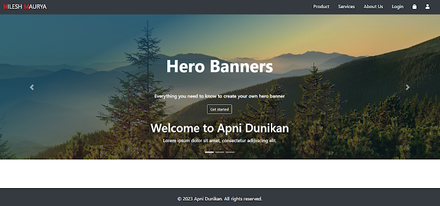
<nav class="navbar navbar-expand-lg bg-dark">
<a class="navbar-brand" href="#">
<span>N</span>ILESH <span>M</span>AURYA
</a>
<button class="navbar-toggler" type="button" data-toggle="collapse" data-target="#navbarNav"
aria-controls="navbarNav" aria-expanded="false" aria-label="Toggle navigation">
<span class="navbar-toggler-icon"></span>
</button>
<div class="collapse navbar-collapse" id="navbarNav">
<ul class="navbar-nav ml-auto">
<li class="nav-item">
<a class="nav-link" href="#">Product</a>
</li>
<li class="nav-item">
<a class="nav-link" href="#">Services</a>
</li>
<li class="nav-item">
<a class="nav-link" href="#">About Us</a>
</li>
<li class="nav-item">
<a class="nav-link" href="#">Login</a>
</li>
<li class="nav-item">
<a class="nav-link" href="#">
<i class="fas fa-shopping-bag"></i>
</a>
</li>
<li class="nav-item">
<a class="nav-link" href="#">
<i class="fas fa-user"></i>
</a>
</li>
</ul>
</div>
</nav>
<script src="https://stackpath.bootstrapcdn.com/bootstrap/4.5.2/js/bootstrap.min.js"></script>
</body>
</html>
Conclusion:
Congratulations! You've successfully created a stylish navigation bar for your website using HTML, CSS, and Bootstrap. By following this guide, your visitors will be able to navigate your site with ease, enhancing their overall experience. Experiment with different styles and layouts to make your navigation bar truly unique and engaging.
Remember, a well-designed navigation bar is a crucial aspect of web development, and with a little creativity, you can make it stand out while ensuring functionality and user-friendliness. Happy coding!


Comments
Post a Comment